Take a look at how these beer cans were designed for production, and later ended up featured in TIME Magazine for their eye-catching design.
We talk to designer Eileen Tjan of OTHER studio and Chad Ashley about the creation of the Peekskill Brewery beer cans recently featured in a special edition of TIME Magazine.
Learn about the process in designing product labels and imagery, then take a glimpse into the making of 3D product renders.

Image via TIME Magazine.
Designing Labels for Products
Michael Maher: Let’s start with you Eileen. Can you tell our readers a bit about yourself?
Eileen Tjan: My name is Eileen Tjan and I’m the Owner/Creative Director of OTHER, a multidisciplinary design studio based in Chicago, IL. We’re about 4 people now! Small but creative and powerful. I’m also the Design Director of Grand Circus Magazine, a Detroit Arts and Culture publication.
I was born in Singapore to Chinese/Indonesian parents, but I was raised in Michigan which is also where I attended university for Fine Arts at the University of Michigan.

MM: Where did your creative career begin?
I came to Chicago in 2010 when the economy was… not so good. After college, I interviewed in New York and Chicago, but I ended up just taking the highest paying internship I could find out of panic. That started my career down the digital path, but I’ve been able to explore many other corners of the industry.
I worked as a web designer at first, made my way into advertising, spent some time at Digital Kitchen which is where I met Chad! I grew my traditional graphic design skills at a boutique design studio in Washington DC and I also took on art direction as a role. The sheer intensity of project managing my own projects, designing and art directing across multiple jobs at the design studio definitely trained me for running my own practice now. Oh, I also did a little time out in Silicon Valley.
MM: Tell me about your relationship with Peekskill Brewery, and how this all came about?
ET: The start of the relationship sounds confusing but isn’t! A friend from University, Ellen Rutt, recommended me as a designer to one of her friend’s from University, Matt Levy, who was the head brewmaster at that time (he has since left). And during this time another one of my friend’s from University was maybe working there? Anyways, Peekskill was ready to embark down the exciting road of canning their beers vs only being on tap at the brew pub, and wanted to introduce some rad new label designs.

MM: That’s interesting, something I often forget about – going from tap to can. What are some of the biggest challenges when it comes to designing imagery for physical products like cans?
ET: Physical products have shape, dimension, they’re 3D! And sometimes the shape of the vessel itself can warp design in ways that were unexpected! There’s also always challenges that come with printing, physical materials… but what I honestly think is most challenging is less about whether it’s a physical product but more if it’s a commercial consumer good and what expectations we have for that product.
Sometimes doing consumer packaging can feel limiting because there are decisions that are just made for you. For example, if you are making something organic and it needs to read fast and true on the shelves, the brand colors will be green or oatmeal colored. That’s a design choice already made for us because it calls back our relationship of those colors to earth!

But, with Peekskill we get away with hyper creativity! Partially because they have much more creative freedom over their products since they are sold within the brew pub partially because the beer scene is already one that embraces art and creativity. What we did have to do though, is design this packaging that didn’t deviate too far from Peekskill’s original branding which we did not design. We had experimented with more playful type, not as art, but on the actual label. Although fun, was not very on-brand for them. So, there was a bit of a learning curve there in finding how far we could push and pull the brand but with the intent of expanding on and leveling up the brand.
MM: When it comes to alcoholic beverages in particular, how did you plan your artwork knowing you’d have to include a specific information, like government regulations and warnings?
ET: We created the labels to be a template where all the key information exists on a flat color band that wraps around the can. The artwork or pattern is free to change behind that band with each new beer introduction.
MM: I see, and what are some of the most challenging aspects of this project?
ET: Sometimes reinventing the art with each beer can feel almost like trying to make a mark on a blank sketchbook page. You want each beer to be even better and cooler than the last, all the pressure builds up! But then you start diving into it, and you realize it’s just an insane amount of fun to be designing graphics for a brewery and that’s the best job.

MM: It is certainly a fun client to have. How do you approach the design of each can. Did you have an overall theme in mind, or do you let each can take on its own look?
ET: We will receive a name, usually from Keith Berardi who is the owner of Peekskill Brewery. And their names have always been super solid, very creative, and had stories tied to them. Whether it’s based on the character of the beer or maybe a special ingredient, Keith always provides us with a little bite of something to go off of that gives the name context.
Then, we’ll go and create moodboards to describe a visual concept we have. There are a few beers that are Peekskill staples. Those fundamental beers are more of a standardized can with either flat color or very slight, non-disruptive patterning. We really get to go wild on the special beers. For example, Amazeballs design has been well received and it’s definitely got an ethereal color scheme and more abstract, surreal graphic pattern.

MM: What are the tools you use when working on one of these projects?
ET: I constantly have open and live inside Adobe InDesign, Illustrator, and Photoshop. I just started teaching myself After Effects (wish me luck!). Suitcase Fusion manages my fonts. I use TextEdit or Sticky Notes to make my personal to-do lists (haha yikes!). I also email myself OFTEN. Is that weird? To Eileen, Love Eileen.

MM: How do you tackle color schemes and layout knowing that your work will appear on an aluminum product?
ET: In most cases, the label color is opaque and wraps most of the can, so we don’t have much issue. Sometimes, we embrace the aluminum! It depends on how Peekskill chooses their label printing method.

In the case of Unique Taste of Millions, we were able to utilize the cool metallic sheen of the aluminum can to create an added depth to the artwork. We left out parts of the art uncolored so the silver could come and interact with the psychedelic label design.
MM: That’s such a fine little detail. What is your workflow in terms of design and creating a final label like that?
ET: I have to finalize designs for print on a dieline which is essentially the labels’ template that directs me to where the label will be cut, safe areas for art, sizing, etc. I outline all my fonts, double check my layers, the colorspace, and package that sucker up for delivery. At that point, I’ve got enough to pass on for 3D rendering.

MM: That’s the perfect segue. Anything you’d like to add before I let Chad fill in the 3D portions of this interview?
ET: Should we all go out for a beer after this? Let’s get a Mezcal shot at Lonesome Rose.
MM: I mean, I don’t want to just look at the labels. I need to know how it tastes. But it has to be good if it was featured in TIME Magazine’s special beer edition. What’s it like knowing that one of your cans was specifically featured for the artwork?
ET: It’s an honor to see our can design next to some other great beers mentioned in that book. We work hard on each can art to make something unique, that’ll stand out, but also make Peekskill feel their hard work is well and accurately represented. So, it’s awesome to know the Time Magazine is giving some love to Peekskill’s great beer and taste in design!
Creating 3D Renders with Cinema 4D and Redshift

MM: Now Chad, can you tell us how you take Eileen’s artwork and bring it to life in 3D?
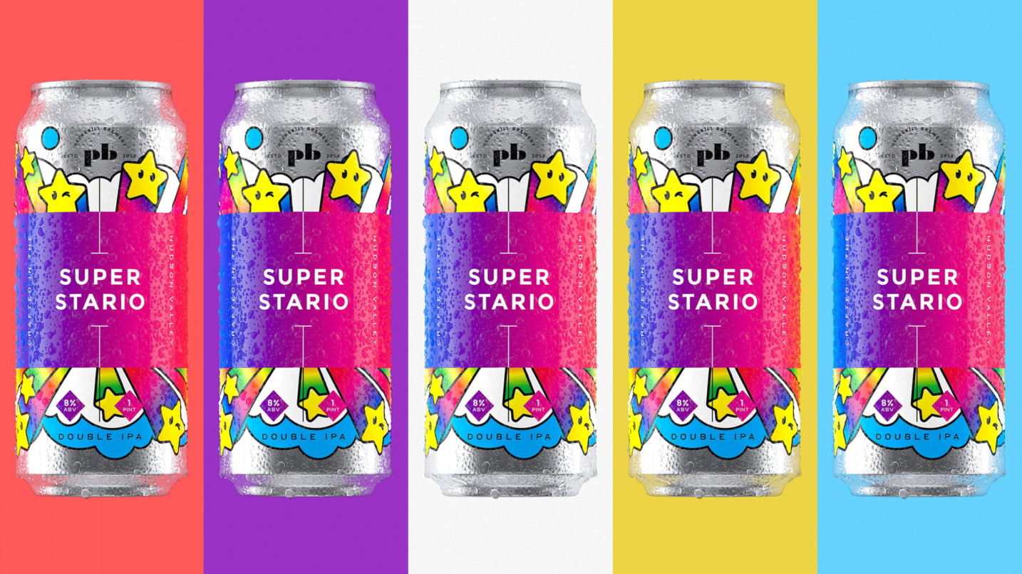
Chad Ashley: It pretty much starts when she sends me all the project files for me to create a texture map. I’ll take her Illustrator label file and then break it down into the layers I will need. For example, for the most recent Super Stario can, I first removed all the government warning and unnecessary text, then made sure I had the logo, label, and artwork separated.

I was also fortunate enough to get a can from the client for reference, so I took a photo of the can with a color checker card to accurately get the proper colors. Then it comes down to finding all the little imperfections from printing to help make a more realistic render. In Photoshop I’ll add some Gaussian blur to the text, some noise and grain to the colors, and other little details like that. I’ll also create a bump map to help define certain features you would see in the real can to help sell the authenticity of the 3D render.
MM: It’s always the slightest imperfections that really sell a look. That and setting the right mood with the lighting.
CA: Exactly. Once I have my texture map ready, then it’s all about lighting and getting the right look in C4D.

MM: How did you light this project?
CA: So this project was done in Redshift, and I primarily used RS lights. I also experimented with some HDRI using HDRI Link.
MM: Interesting, so you didn’t use Light Kit Pro 3?
CA: It didn’t exist yet! Keep in mind, we were still developing Light Kit Pro 3 when I was working on this project. So this was done primarily with Redshift’s lights, with the area light being my go-to for this particular project.
MM: How do you go about creating a mood for the lighting?
CA: I use reference photos a lot. A mix of photography and other renders of cans. When I find something I like, I save it to a moodboard, and then when it comes time to create the look, I’ll use PureRef to keep those reference photos handy. I’ve talked about PureRef before, so anyone reading may want to check out that PureRef post.

I’ll create a few different looks, and the ones I like the most will get sent off for client review. Then it’s all about fine tuning the look to what the client wants.
MM: Anything else you’d like to share about this project?
CA: Yeah, I actually recorded my entire process of creating the Super Stario cans. I wanted to create some kind of training that explains my whole process and workflow. I talk about working with clients, tools I use, and some other tips and tricks throughout the whole process.
We’ve included the entire process in the Greyscalegorilla Plus, I think this part by itself is just over 10 hours of training. I walk through Photoshop, C4D, Redshift, and comping in Fusion. There are even parts with some X-Particles training and creating an animation the client used on Instagram.
MM: Can’t wait to check that out. Now Chad, everyone here knows all about you. Eileen, where can our readers find out more about you and your work?
ET: Is this where I do a plug? OTHER Studio can be found on the world wide web at other-studio.com. But, we honestly update our instagram (@_otherstudio) far more regularly. We’re also on Facebook, Dribbble, and Behance.
I have a personal art portfolio as well. This is my illustration, custom type, and pattern work: eileentjan.com.
Images via OTHER Studio.
Nice Cans!
Create Realistic Product Renders With Your All-Access Pass to the Training You Need
Join Plus
2 Comments
Nice work, and great read!
We’re glad you enjoyed it!