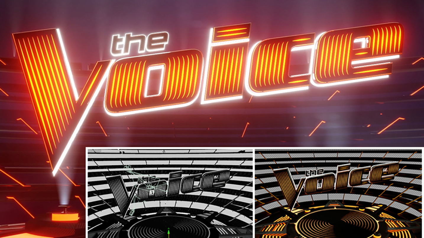
Family-owned studio, The Other House, explains their work on the brand refresh for the fourteenth season of The Voice.
Working with loved ones is often ill-advised, but that’s not the case with The Other House. Founded in 2011 by brothers Chris and Steve Roth and their wives, Amber and Lara, the Portland, Oregon-based boutique motion/production studio embraces its identity as a family-owned business that also includes a tight-knit group of talented friends.
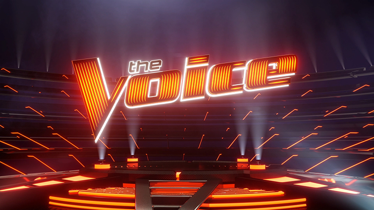
The Voice’s brand refresh included a vibrant new color scheme and an auditorium-inspired center piece and bleachers. Image via Live Animals / NBC / The Other House.
Among the award-winning studio’s latest projects was a complete brand refresh for season 14 of NBC’s The Voice. Here Chris Roth, The Other House’s Executive Director and Principal Animator, explains the origin of his small yet well-connected studio and talks about how they used Cinema 4D, After Effects and Octane to infuse The Voice’s iconic look with a whole lot of orange-hued energy.
Meleah Maynard: Tell me about you and your brother, and how you decided to start a business together.
Chris Roth: My brother and I have always been pretty creative. We grew up in Los Angeles and I went to Parsons School of Art and Design in New York for illustration, and my brother went to the Academy of Art University in San Francisco to study film. After graduation, I spent about a decade as a freelance illustrator, and Steve was writing, directing and producing commercials, music videos and short films.
At the same time, my wife, Amber, was working as a stylist and costume designer and Steve’s wife, Lara, was a producer. All of us were freelancing, so in 2011 we decided to come together and start a company. We were pretty naïve about how it would all go starting out, but it was one of the best decisions we’ve ever made.

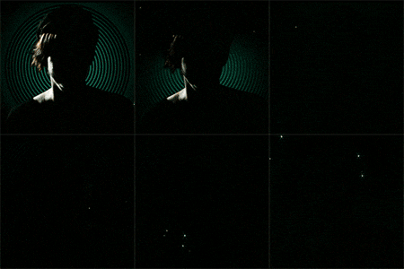
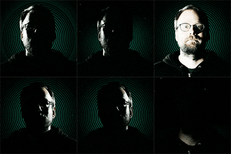

Founders Chris Roth, Amber Votel, Steve Roth, Lara Ravdjee Roth. Images via The Other House.
MM: What is it like to be based in Portland rather than New York or L.A.?
CR: We love the quality of life here, but it can be a bit of a challenge because the market is much smaller. It has worked out particularly well though, because we all had developed a lot of contacts before we moved here. I spent 12 years in New York City and met a lot of great people there. I initially started freelancing as a traditional illustrator, but it wasn’t until I started billing myself as a motion graphics and animation guy, that a much wider scope of work came my way.
A pivotal shift happened during a two-year stint in the promos department of WCBS News in New York. It was there that I really honed my broadcast design skills and learned to work really fast to put together graphics packages for a variety of news stories every day.
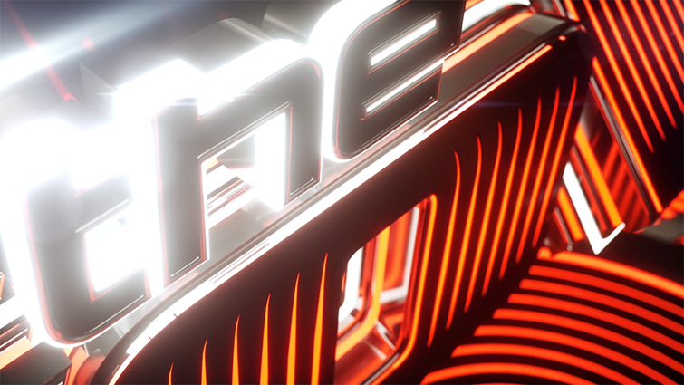
With the exception of volumetric lighting, The Other House primarily relied on Cinema 4D and Octane for this project. Image via Live Animals / NBC / The Other House.
Around 2009, my wife and I decided we wanted to move to Portland, where Adam Gross and Andrew Nicolai, two of my main designers and longtime friends from Parsons, already lived. My brother and his wife moved here recently too.
We all love it. Adam, Andrew and I all have young daughters, so it’s been fun to be in the same boat with managing work and kids. Our office space is only about 700 square feet, and we all commute about 5 minutes to get there, which is great.
MM: Describe the kind of work you do.
CR: In our early years, we initially made a mark by producing numerous book trailers for Random House and Macmillan publishing companies. The rise of smartphones and e-book readers really opened up a whole new market of motion graphics for books.
In the last few years, our focus and breadth of work has evolved a lot. Currently, we mostly do broadcast branding and motion design work. We still produce some book trailers, but not nearly the volume we used to.
One of our most extravagant trailers was for Amanda Hocking’s Watersong series.
In five days, we shot at seven different locations, including an underwater live-action shoot.
MM: How did you get The Voice project?
CR: Over the last few years, we’ve done a lot of work for NBC and developed a great relationship with a bunch of people there. One of the producers of The Voice has become a good friend and regular work contact, so we’ve done a lot of work for her and her husband.
A few years ago we worked with him on our biggest job to date, which was the network branding and launch of Sean “Puffy” Combs’ Revolt TV cable music channel.
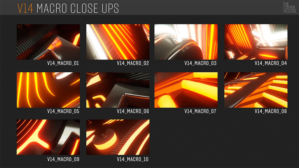
This frame from the asset PDF that was created for the client offers an overview of what was delivered so that the show’s editors could quickly find what they needed. Image via Live Animals / NBC / The Other House.
MM: What kind of creative direction did they give you, and how did you run with that?
CR: The Voice had already gone through three refreshes, so for season 14 they wanted to do something really different. The only catch was, they didn’t have much time, less than a month in fact. Yet, we couldn’t turn down an opportunity to throw our hat into the mix for such a great brand.
They sent me a photo of the newly designed judges’ chairs, which featured recessed veins of glowing lights. While The Voice’s primary color has always been red, we wanted to push it into a slightly new palette, so we explored a sort of inner-orange energy that was inspired by the new chairs.

The strength of the design, and its ability to carry the look, is visible in this screenshot of the team’s main Cinema 4D workspace. Image via Live Animals / NBC / The Other House.
I also wanted to find a way to inject the logo with a similar turbo-charged inner energy. We were inspired by the way new, high-end graphics cards tend to be super decked out with LED lights and heat dissipation features. One of our brilliant designers, Ed Price, played a key role in developing the first style frames that spawned the new look.
We were really impressed with the network’s willingness to take some risks by dropping the signature V-shaped microphone/hand and fully embrace the shift into orange territory. In the end, it was one of the fastest branding jobs we’ve done, and we couldn’t be happier about how everything turned out.
MM: Describe your process. How did you streamline your pipeline to meet the deadline?
CR: It really was the breakthroughs in GPU rendering that made it possible to turn this out so quickly. We have a very fast workstation with four GTX 1080 Ti graphic cards inside running Octane.
We started with all of these beautiful vector shapes in Illustrator that were then extruded and arranged in Cinema. We output OpenEXR file sequences with all of the necessary channels baked in.
Next, the sequence was imported into a different compositing workstation so I, or someone else, could be simultaneously working on compositing even while the 3D was still being refined.
We also really enhanced our workflow pipeline with a couple of great Greyscalegorilla plug-ins, HDRI Link and Signal.
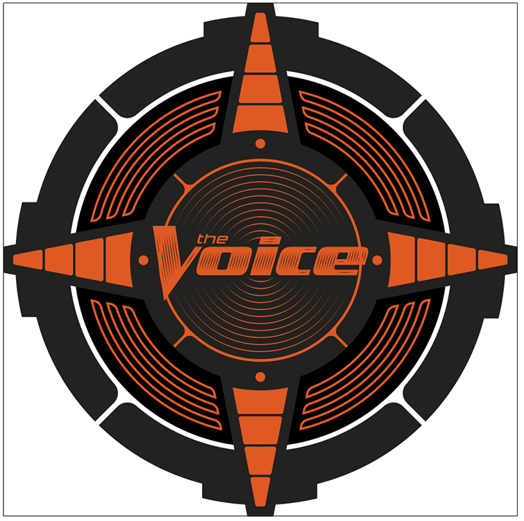
Designer Ed Price used Illustrator to create The Voice logo mark and related shapes from which the entire scene was built. Image via Live Animals / NBC / The Other House.
For the final reveal, I wanted all of these volumetric lights but to save time we did them in After Effects using the Trapcode Lux plug-in. Due to the really quick turnaround, we relied on Element 3D from Video Copilot to build many of the lower thirds and other tertiary graphics.
We also built The Voice a toolbox of gorgeous macro shots that the editors could use for promos and teasers and cold opens.
MM: What are you working on now?
CR: We’re in the midst of quite a few fantastic projects. We’re very excited to be doing all of the graphics for upcoming NBC show, The Titan Games, a sports competition series hosted by Dwayne “The Rock” Johnson.
We’re also doing the Teen Choice 2018 awards for FOX and producing a dynamic intro for a new scripted show about UFOs that will be on the History Channel.
Also, we just wrapped the 2018 Emmys. In 2017, we had the great honor of doing the key art, and this year we did the key art, official invites and print materials.
The Voice Credits:
Produced by The Other House PDX
Clients: Live Animals/NBC
Creative Director: Chris Roth
Designer: Ed Price
Designer: Andrew Nicolai
Designer: Adam Gross
Designer: Josh Strike
Meleah Maynard is a writer and editor in Minneapolis, Minnesota.
Animate to Audio with Signal
Unlock Signal
The most powerful animation plugin for Cinema 4D. Easily create loops, stop-motion effects, or time your animation to music. Now included with your Greyscalegorilla Plus membership!
Unlock Signal with PlusGet Signal